Case Study · Shipped Q3 2024
eTutor Pro
Redesigning the lesson booking flow — from 9 steps down to 3.
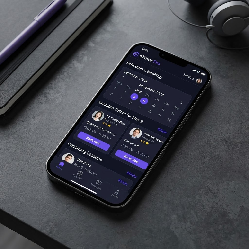
Overview
eTutor Pro is a platform connecting students with private tutors across Poland. When I joined the project, the booking flow spanned 9 separate screens — users had to select a subject, browse tutor profiles, pick availability, confirm details, add payment, review a summary, then confirm twice. Drop-off at each step was significant, with over 60% of users abandoning before completing a booking.
The goal was to dramatically simplify the path from intent to confirmed lesson. I worked directly with the product manager and two frontend engineers to consolidate the flow into a three-step modal — select a tutor, pick a time slot, and confirm with payment. The redesign also introduced a persistent tutor card that kept context visible throughout the booking process.
My contribution
- Product strategy
- User research
- Product design
- Prototyping
- Design handoff
The team
- 1 × product manager
- 1 × product designer
- 2 × engineers
- 1 × QA
Year
2024
The problem
The original booking flow was built incrementally — each new requirement bolted onto the existing screens without a holistic review. The result was a fragmented experience that felt more like filling out a government form than booking a lesson.
User interviews revealed three recurring pain points: losing track of which tutor was selected halfway through the flow, uncertainty about the final price until the last screen, and frustration at having to re-enter details they had already provided during sign-up.

The solution
I consolidated the nine screens into a single bottom-sheet modal with three clearly delineated steps. The tutor card — including photo, subject, rating, and hourly rate — remained pinned at the top of the modal throughout, eliminating the "who was I booking again?" confusion.
Price transparency was addressed by surfacing the total cost immediately after slot selection, with a clear breakdown before any payment details were required. Pre-filled information from user profiles removed the need to re-enter contact or billing details entirely.
Outcomes
−67%
Steps in the booking flow
from 9 to 3
+41%
Booking completion rate
within 60 days of launch
−28%
Support tickets
related to booking issues
What I learned
The biggest unlock was separating the concept of "browsing" from "booking". Users wanted to explore tutors freely, then commit to a booking in a focused, contained context. Mixing the two into a single linear flow created anxiety at every step.
Showing pricing earlier than it felt "necessary" to the business team actually increased conversion — users who knew the cost upfront were more committed by the time they reached payment, not less.